
Basecamp
Tasks, feedback and deadlines in one place.
Guide · Stormbæk
Explore nine design directions and find what feels right for your business. You can combine elements from different styles — what matters most is that customers easily find what they need.
Updated 6 October 2026
External design examples for inspiration — not projects created by Stormbæk. Click an image to view it larger.
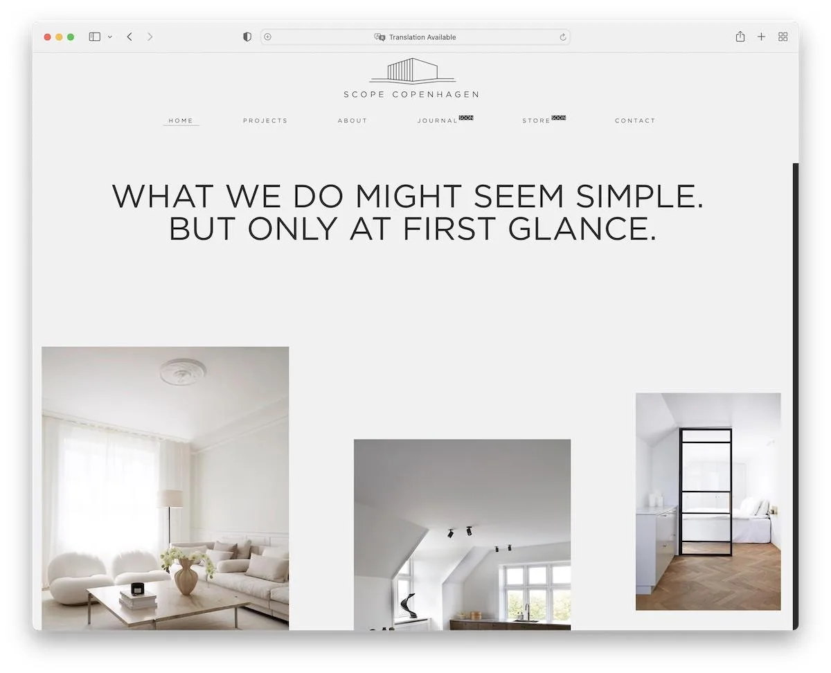
01
Space, few colours and simple typography create a calm feel. Suits businesses where images and a clear message take the lead.
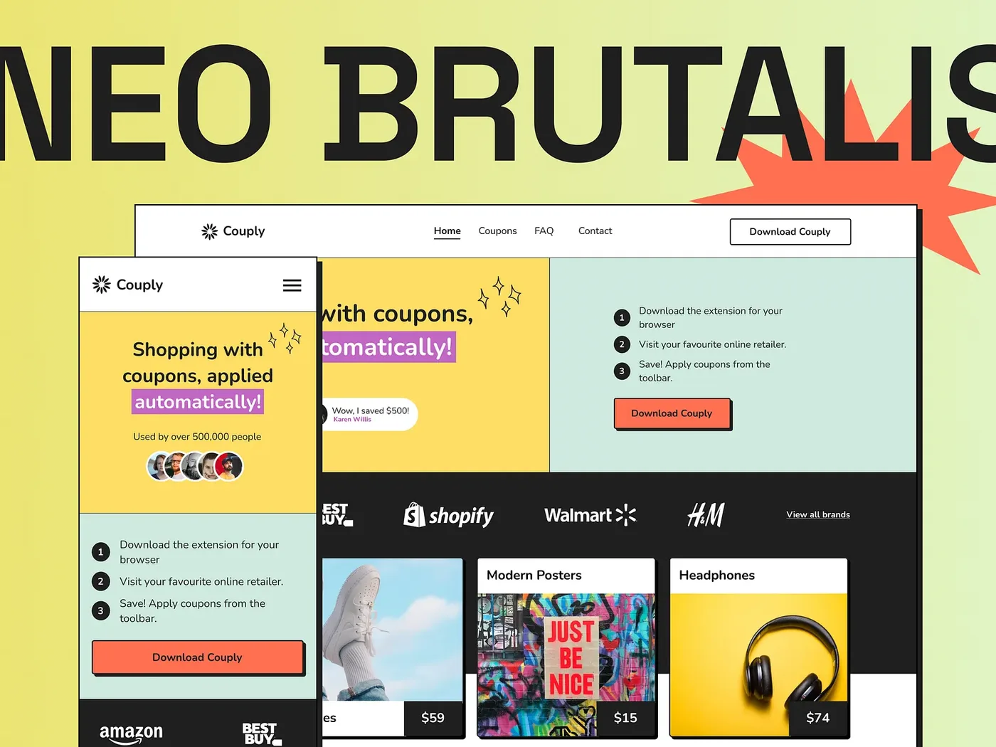
02
Bold borders, strong contrasts and large lettering. A direct, playful style for brands that want to stand out.
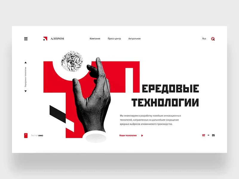
03
Geometric shapes, diagonals and collage create movement. Suits a graphic identity with a surprising composition.
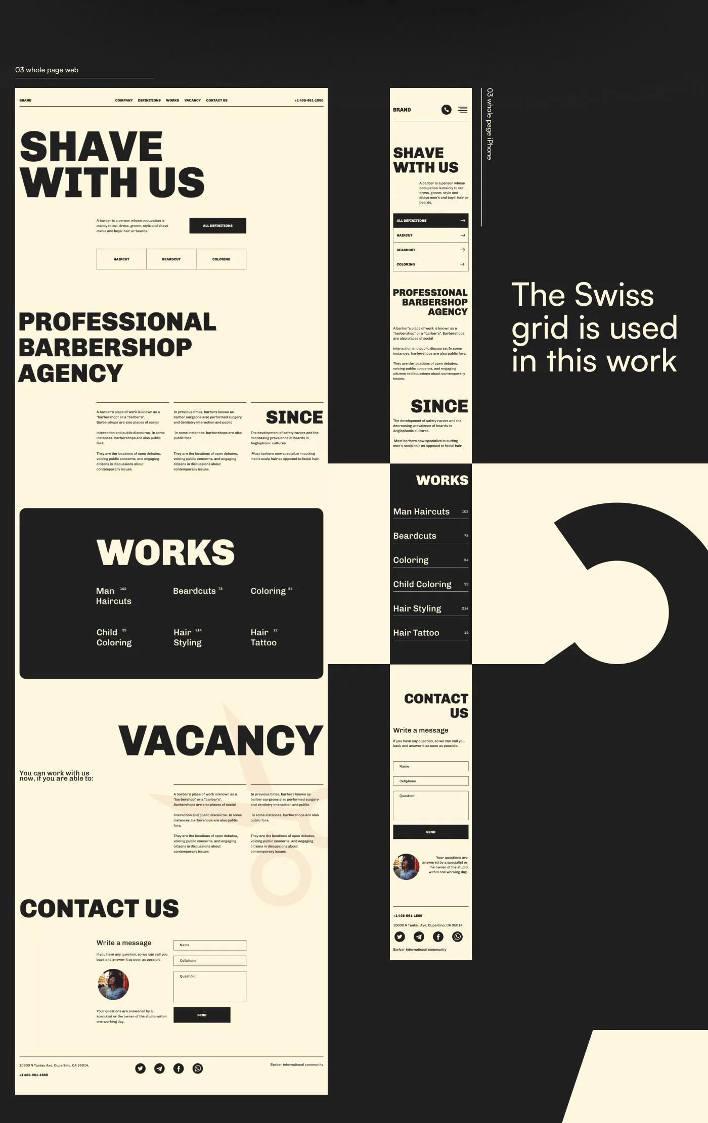
04
A disciplined grid, clear hierarchy and precise typography create order. Useful when a lot of content needs to be easy to navigate.
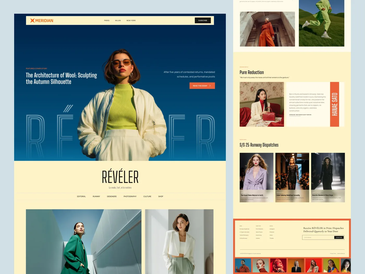
05
Large photos and varied text layouts create a magazine feel. Suits storytelling, fashion, architecture and visually rich content.
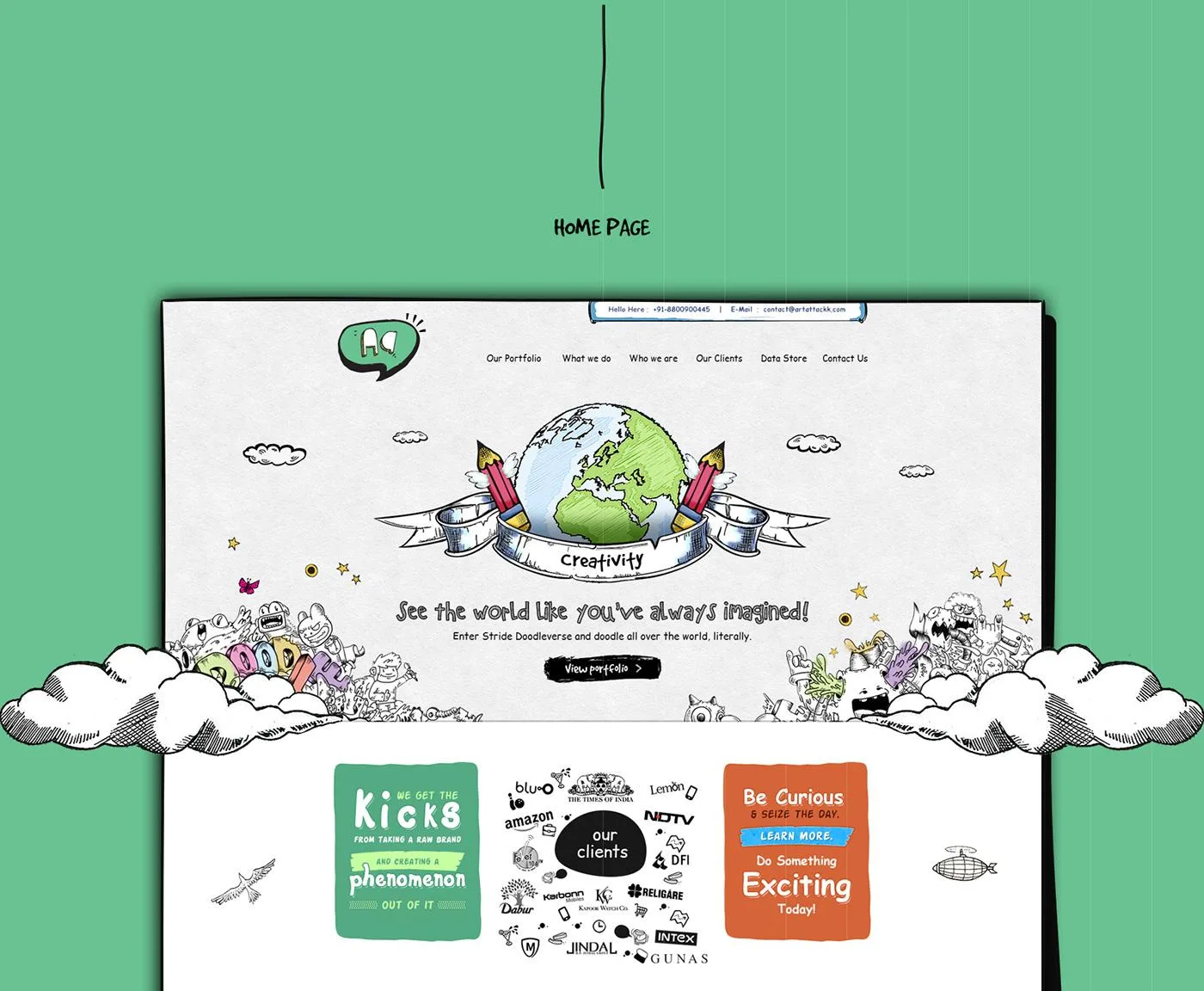
06
Illustrations, hand-drawn lines and small imperfections add personality. Suits creative businesses and brands with an informal voice.
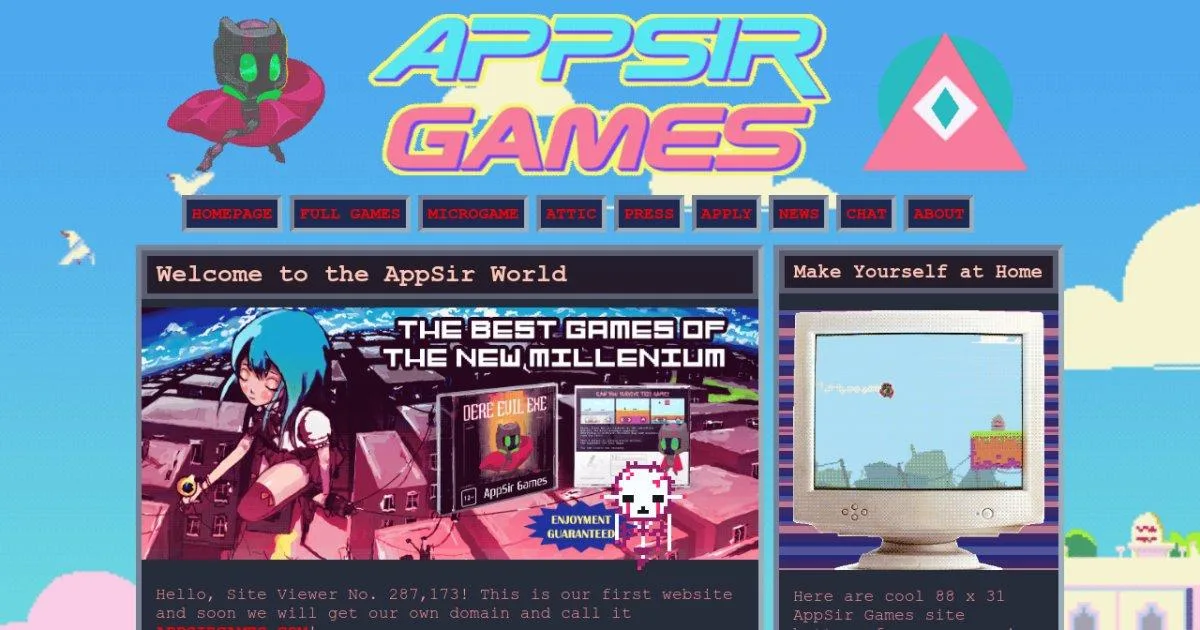
07
Nostalgic colours, pixels and classic web elements look back in time. Creates a distinctive world while keeping navigation simple.
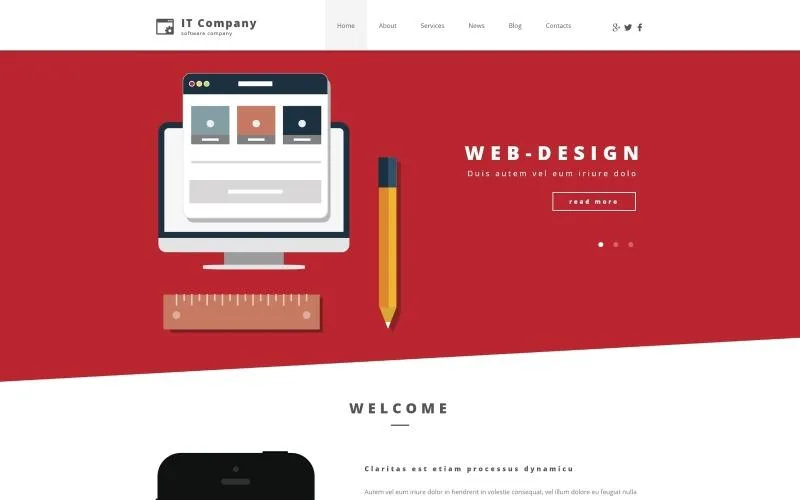
08
Simple illustrations and clean colour blocks make the message easy to read. Useful for explaining products and services without many visual effects.
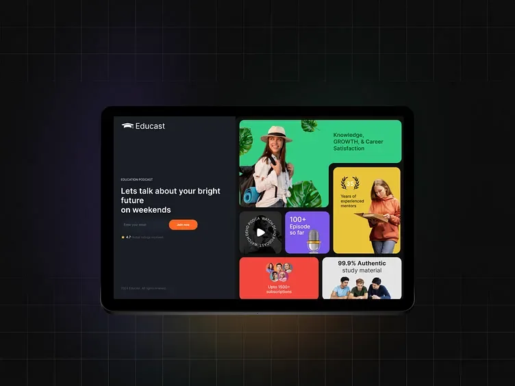
09
Content is arranged in tiles of different sizes. Useful for showing features, benefits and images in one overview.
Choose two examples you like and explain why: the colours, photography, calmness or typography. Tell us who your customer is and whether the goal is a call, booking or enquiry. You can combine elements from different directions.
Kildehøjgård → · Caesar’s Soul Surf →
The case studies show real projects with their own constraints. For Caesar’s Soul Surf, we improved the existing website while preserving the client’s overall design.
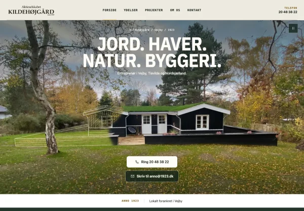 A project by Stormbæk
How we combine the styles
A disciplined grid as the foundation. Space around the content. And a touch of editorial design in the images and storytelling.
Our interpretation of the design’s blend of styles.
Explore the Kildehøjgård case ↗A 20-minute conversation about your project, your goals and how we can help. We look at your current situation and give an honest assessment — no sales pitch, no obligations. Bring a brief description of what you need so we can make the most of the time.
Prefer to email or call?
Having trouble with the calendar? Open it in a new tab
How we organise your project
Tasks, feedback and deadlines in one place.
Access is handled securely and shared only when necessary.
The code is version-controlled and documented.
Powers the functionality behind our chat and contact forms.


